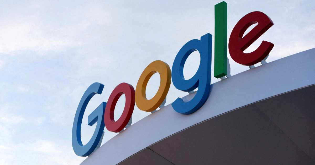

After nearly a decade Google the world’s most popular search engine and tech giant has decided it’s time for a fresh new look. This isn’t just a random tweak or a seasonal refresh. It’s a major redesign of one of the most recognized logos in the world.
Google has introduced a brand new version of its iconic logo after nearly a decade, blending its signature colors in a more dynamic, modern, and user-friendly design. Discover the story behind this global rebranding.
On May 11, 2025, some iPhone users noticed something different after updating their Google Search app. The familiar “G” had a new vibe more vibrant, more dynamic, and somehow more “Google.” By the next day, Android users got a glimpse too, as the beta version of the Google app rolled out the redesigned logo.
So, What’s New in the Logo?
At first glance, you’ll see that the English letter “G” is still there but now it wears a bolder, brighter coat. Google’s signature four colors—red, yellow, green, and blue haven’t gone anywhere. But in this version, they feel more balanced, more fluid, and more integrated. It’s like the colors are dancing in harmony rather than standing in line.
This isn’t just about looking good. Google says this change is part of a larger effort to make its branding more adaptive across different devices and platforms. Whether you’re using a tiny smartwatch, a smartphone, or a massive monitor, the new “G” is designed to look sharp and stay recognizable.
Soon, this new design will appear not only in mobile apps but also on browser tabs, replacing the small icon known as the “favicon.” Over the next few days, Google will gradually introduce this refreshed identity across all devices and services.
A Logo That’s More Than Just a Logo
For over five billion people who use Google worldwide, the logo isn’t just a graphic. It’s a symbol of trust, knowledge, and daily digital life. Whether you’re searching for homework help, news updates, or dinner recipes that colorful “G” is your gateway.
That’s why even a subtle logo change becomes big news. When Google changes, it matters because it’s part of how we experience the internet itself.
Looking Back the Last Big Change Was in 2015
In 2015, Google made its last significant logo redesign. That’s when the company ditched its classic serif font for a clean, modern, and digital-friendly typeface called “Product Sans.” They also introduced a new icon a capital “G” inside a circle, colored with the brand’s four iconic hues. That simple shift made Google’s design more consistent across apps, browsers, and devices.
But 10 years later, the digital world has changed again. Voice search, AI, touchscreens, and smart devices are now part of our everyday routine. And so, Google’s logo needed to evolve once more not just to keep up, but to stay ahead.
Why Did Google Change the Logo Now?
Google explained the decision with three main reasons in mind:
-
Cross-device consistency:
From phones to tablets to smart TVs, the logo now fits better in any digital environment. -
Multimodal interactions:
Google isn’t just typed anymore—it’s tapped, spoken to, and even sensed. The design now reflects that dynamic range of interaction. -
A global brand for everyone:
This new logo speaks a universal visual language—bright, friendly, and instantly recognizable anywhere in the world.
Read More: Trump Announces $14.5 Billion Etihad Deal with Boeing and GE Amid $200 Billion UAE Commitments
Designing Emotion Into Pixels
This new logo is more than just a design update it is an emotional re-calibration. The four colors aren’t just aesthetics. They symbolize openness, diversity, creativity, and technological innovation. By arranging them in a more unified, playful way, Google is visually reminding us that it’s still here to help, explore, and grow with us.
If you’re someone who loves design, you’ll appreciate the subtlety: better spacing, color transitions that feel organic, and a sharper look that scales well across all screen sizes.
But even if you’re not a design enthusiast, you’ll feel the difference. It’s like when your favorite app updates and suddenly feels more “you.” That’s what Google has done here without changing who they are.
A Quick Look at Google’s Logo Evolution
| Year | What Changed |
|---|---|
| 1998 | The very first logo—simple and created in a rush |
| 1999 | Font and color improvements for a cleaner look |
| 2010 | Shadows removed and colors made brighter |
| 2013 | Flatter, more modern design |
| 2015 | Switched to Product Sans; added iconic multi-color “G” |
| 2025 | New “G” design with a more unified, dynamic color flow |
The Bigger Picture
Google’s logo is more than branding. It’s part of how we interact with the world. It shows up every time we ask a question, search for knowledge, or find direction in a new city. When Google updates its logo, it reflects not just a company’s vision—but our changing relationship with technology.
And this time, the message is clear that tech should feel bright, open to human. So the next time you see that colorful “G,” take a second to appreciate how far we’ve all come. It’s not just a new look, a new chapter.
Share via: